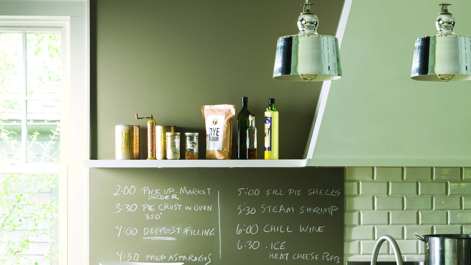
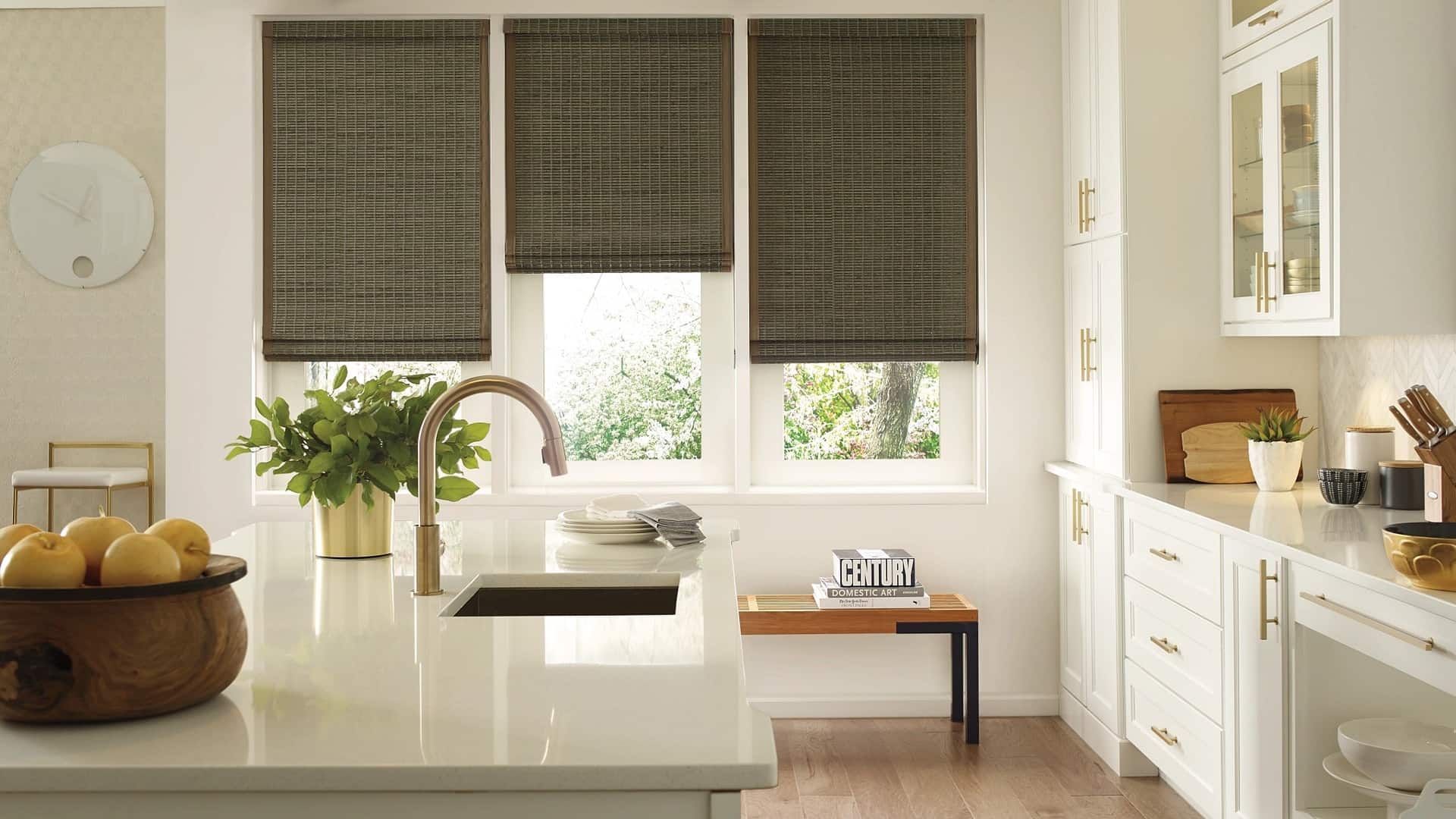
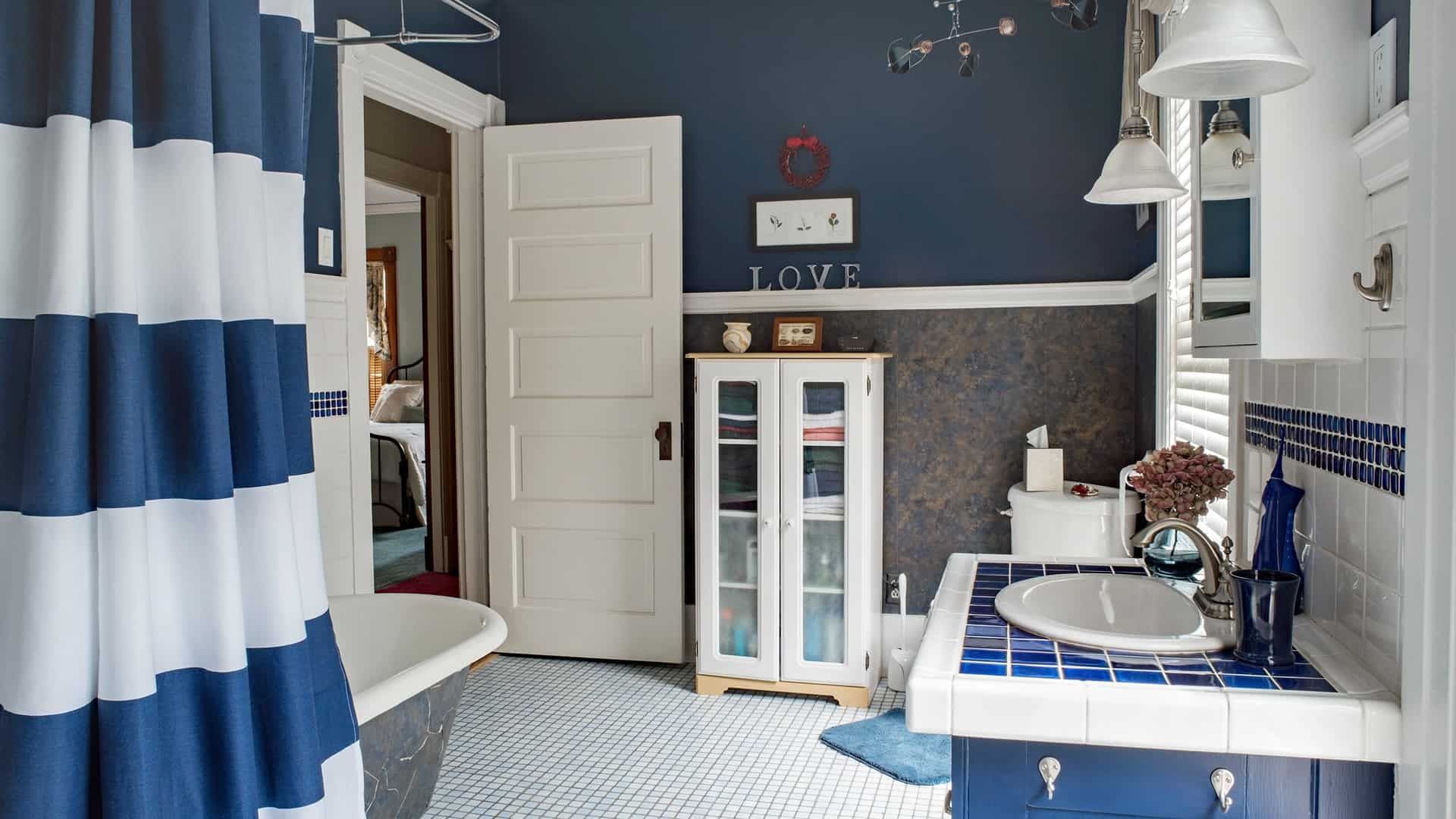
Try A Fall Color Palette ft. Benjamin Moore Color of the Year 2024
At Stevens Paint & Blinds, one of our favorite Fall traditions is unveiling the coming year’s Benjamin Color of the Year and showcasing the many ways that you can add timeless and on-trend colors into your home.
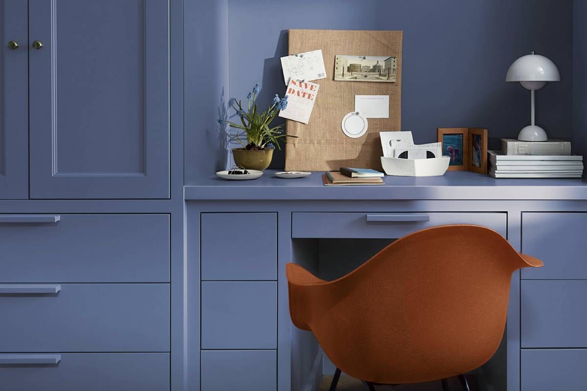
In 2023, it was all about Raspberry Blush 2008-30, an energetic coral with hints of pink. As we wait to show you the 2025 Color of the Year, we wanted to take a moment to celebrate our Benjamin Moore Color of the Year 2024, Blue Nova 825, and express some exciting ways that you can incorporate this inclusive mid-toned blue into your home with our special fall color palette.
Our team at Stevens Paint & Blinds is here to show you new and exciting ways to use color with Benjamin Moore paint. Give us a call or visit our showroom locations in Vestal and Corning, New York to learn more about our paint selection from Benjamin Moore and PPG, custom window treatments by Hunter Douglas, and so much more.
Celebrating Benjamin Moore Color of the Year 2024: Blue Nova 825
Throughout 2024, we’ve celebrated Blue Nova 825 for its expansive and intriguing duality. A gorgeous midtone blue with a hint of dusty lavender undertones, this color celebrates a connection between the old and new. In 2024, we noticed trends of neutral tones with surprising pops of color, including nuanced contrasting accents. Whether you choose to paint your entire space in Blue Nova 825 and enjoy the restful vibes and classic feel of the color, or accent your space with one wall or features of Blue Nova 825, this color works well with many interior design styles and remains fresh all year long—which is why it’s a great addition to our fall color palette!
Check out Our Fall Color Palette
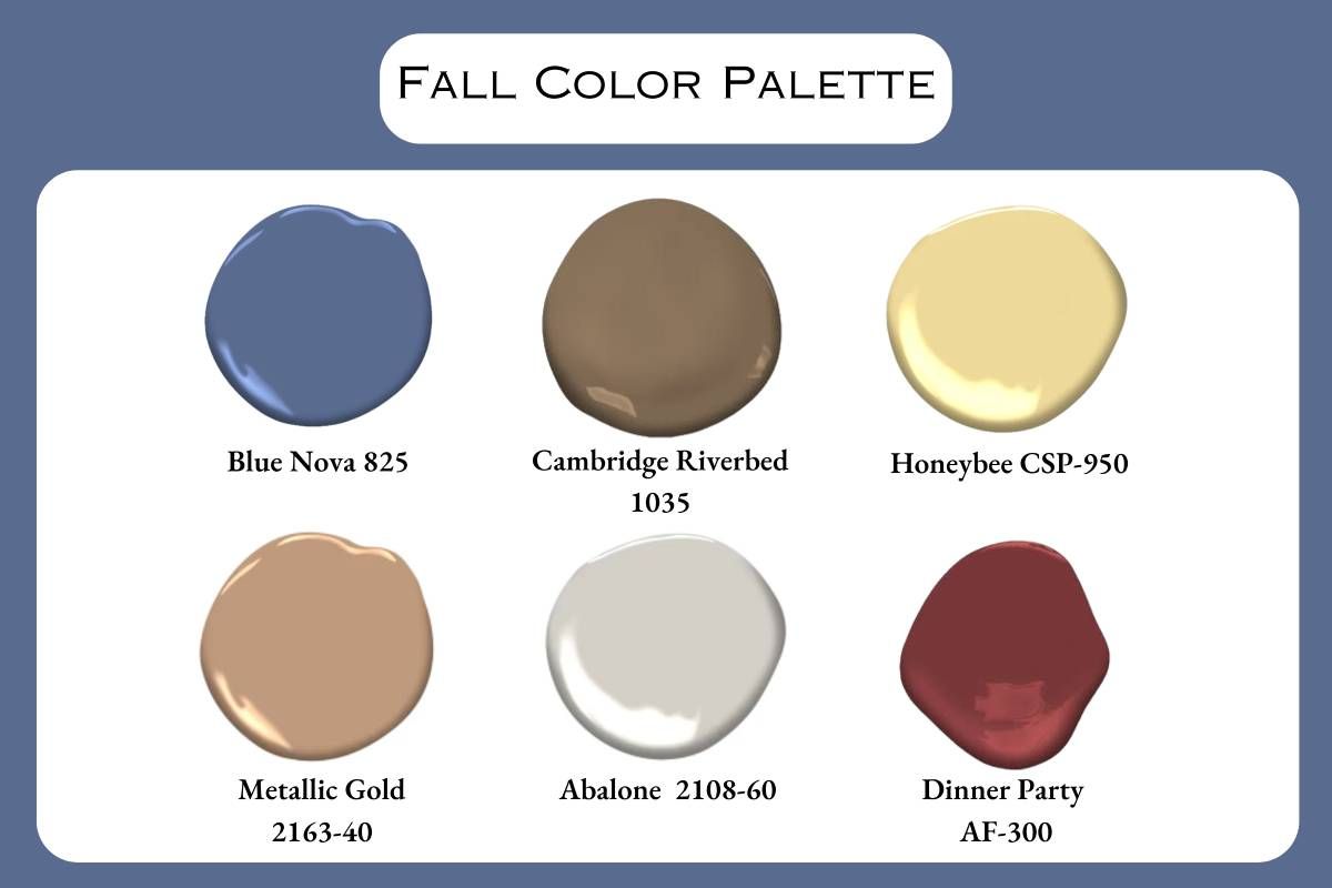
When we developed this color palette, we wanted to keep in mind some of the feeling of our favorite fall colors in a usable way that stays contemporary and stylish all year long. For inspiration, we took the image of a family taking a beachside walk on a cool, autumn morning before going apple-picking in their favorite fall knitwear. Feel free to mix and match any of these tones or add your own favorites to create a unique interior design all your own!
This palette offers a balance of warm and cool tones, with the soft light gray acting as a neutral bridge between the colors. The slightly dusty violet blue and the deep red with plum undertones sit at opposite ends of the color wheel, creating a dynamic contrast. The warm dark brown and midtone gold provide richness and depth, while the soft yellow adds a touch of lightness and cheer.
Benjamin Moore Blue Nova 825
A sophisticated hue, Blue Nova 825 combines the calming properties of blue with a bit of violet. It has a certain level of depth and maturity, making it less overwhelming for use in a whole space than a pure violet or blue. This color could also work beautifully as an accent wall in a bedroom or living room, creating a serene and dreamy atmosphere.
Benjamin Moore Cambridge Riverbed 1035
Rich and grounding, Cambridge Riverbed 1035 evokes the warmth of aged wood or fine leather. The taupe undertones add a touch of sophistication, preventing the brown from feeling too heavy or dark. This shade would be perfect for creating a cozy den or study, or as an anchor color in a larger space.
Benjamin Moore Honeybee CSP-950
Cheerful and inviting, Honeybee CSP-950 brings a touch of sunshine to any room. Unlike brighter yellows, this muted version is easy on the eyes and creates a gentle, welcoming ambiance. It's an excellent choice for kid’s rooms and nurseries, kitchens, breakfast nooks, or any space where you want to evoke a sense of warmth and optimism.
Benjamin Moore Metallic Gold 2163-40
This complex and nuanced color is truly unique. Metallic Gold 2163-40 is a blend of warm metallic gold with earthy sand and soft rose to create a color that's both elegant and comforting. It could serve as a stunning accent color in a neutral room or as the main color in a space where you want to create a sense of luxury and warmth.
Benjamin Moore Abalone 2108-60
A versatile neutral, Abalone 2108-60 provides a perfect backdrop for other colors to shine. It's more interesting than plain white but still maintains an airy, open feel. This color could be used throughout a home as a unifying element, even as trim, allowing other colors and textures to take center stage.
Benjamin Moore Dinner Party AF-300
Bold and dramatic, this color exudes passion and energy. The plummy undertones of Dinner Party AF-300 add depth and sophistication, preventing this deep red from feeling too aggressive. This would make a stunning accent color, perhaps on a single wall in a dining room or as part of a color scheme in a home office or library.
Shop Benjamin Moore Paint Colors Near Vestal and Corning, New York
Remember, when experimenting with new colors, consider the 60-30-10 rule: use your dominant color (perhaps the soft light gray or the warm dark brown) for 60% of the room, a secondary color for 30%, and an accent color for the remaining 10%. This will help create a balanced and harmonious space.
At Stevens Paint & Blinds, our team is standing by to help you find the perfect colors for your home. Visit us on one of our two locations in Corning and Vestal, New York, or contact us online for a free in-home consultation.
With decades of experience as a family-owned business, we proudly serve the Vestal, Corning, Ithaca, Elmira, Penn Yan, Watkins Glen, Hammondsport, Geneva, Johnson City, Endicott, Binghamton, Waverly, NY, and Sayre, PA communities.


